Timeframe
3 months / 80 hours
My Role
Ux/Ui Designer & Researcher
Tools
Figma, Adobe Illustrator, Optical Workshop
Overview
The Problem
The Approach
Research
Research Methods & Plan
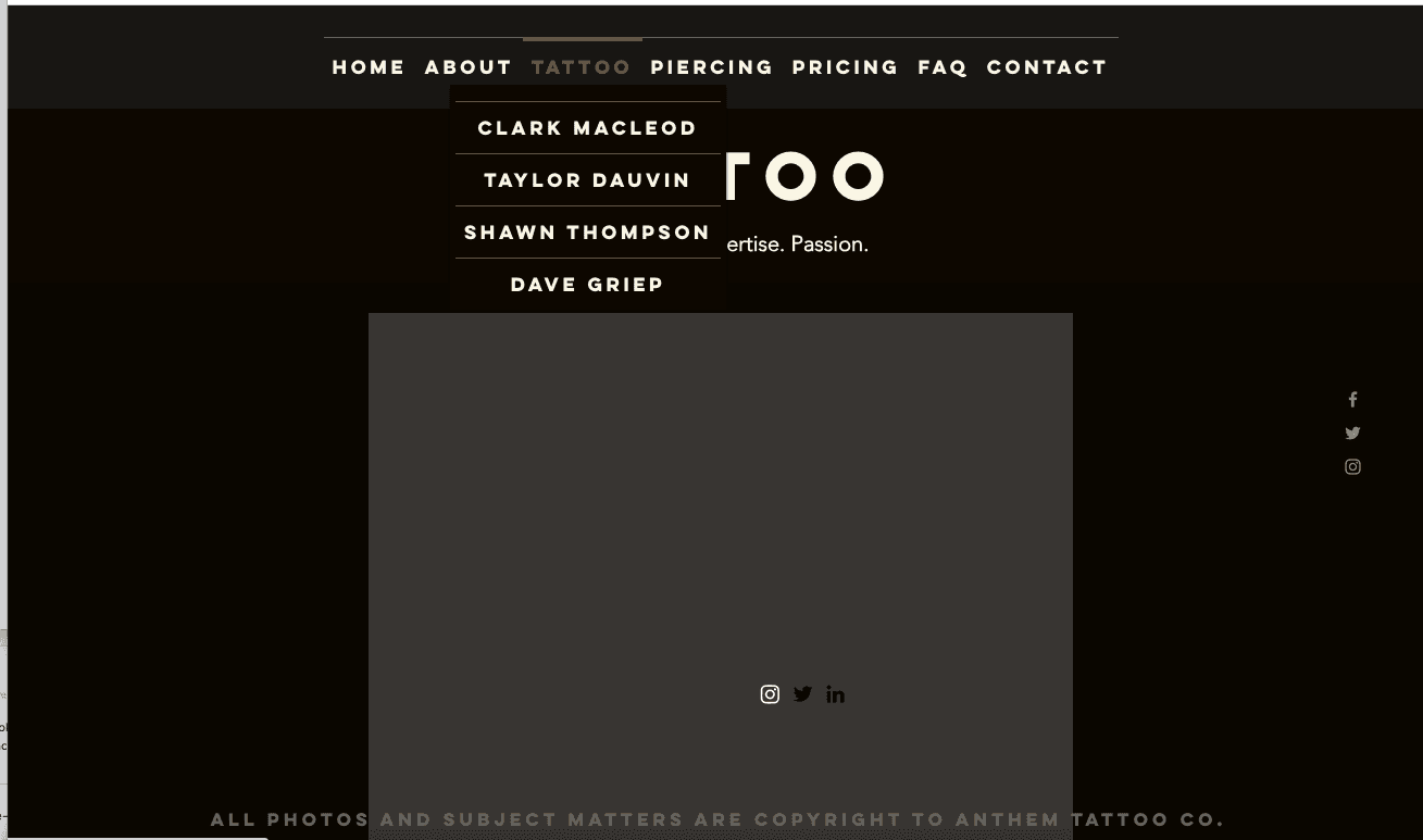
Overall, the user testing was a success based on the feedback I received. The overarching sentiment was that the site, while it served its purpose, there were a few missing elements that could enhance the overall experience. There were repeated pain points in terms of navigation, missing info and too much text was often mentioned. All of these things provided enough to validate a new redesign.
Competitive analysis
This competitive analysis provided valuable insights. By examining three similar tattoo shop competitors, I identified their strengths and missing features, allowing for improvements to Anthem’s current solution.
Bombshell, Atomic, and Champion Tattoo are all worthy competitors with excellent features and contemporary website designs. Champion Tattoo, the closest to Anthem, offers the most features, including its own podcast. Bombshell is the most complete, while Atomic has the most innovative layout but lacks a few features compared to Bombshell. Anthem Tattoo can close the gap by adding additional features and innovating its digital platform. The current Anthem website is missing some key features, such as a proper booking system, artist social media links, aftercare information, and their own brand merchandise.
The next step is to integrate these features to significantly improve the site and boost business for the brand.
Define
Personas
I developed these personas based off the preceding research findings validating the design choices prior to implementation. I referenced these throughout the design process and helped based on real user needs and goals
User flows
Three user flows were developed to provide clarity on how users would accomplish specific tasks.
This was valuable by revealing the interactions and entry/exit points users will face.
A new nav bar design was requested by users
Adding the Merch/Store meant I needed to implement this into the new sitemap
The sitemap now accurately reflects the final layout of the new site
Re-did the sitemap to reflect the new features and new design
Design
Sketches
The use of sketches to begin my design process was key in finding the best direction for the new layout and new features.
I began by sketching the key screens first revamping artist page home page for both mobile & desktop.
Lo-fi Wireframes
Digital Wireframes
I focused on these key screens, which brought my design to life and validated my decisions based on user feedback.
Visual System
Prototyping
Usability Testing
Book a consultation with Shawn
Buy a black Classic Hoodie
View Clark’s Artist page
Revisions needed/suggested
Next Steps
Results
Observations
“Logical sequence and made sense/easy to follow”
“Very easy to navigate and I liked the way the visuals were spaced out.”
Summary
Changes/Iterating
The Solution
View Prototype
Other Screens
Here are some additional screens to highlight some of the expanded features and offer a thorough perspective on the user experience.
Reflections
What I learned
Reflecting on this project, I realized I learned a great deal and consider it a great success. I discovered that having a solid strategy is crucial for initiating the redesign process. Additionally, I recognized the significant value in the process itself. By thoroughly understanding user behavior, preferences, and tendencies, I was able to focus on what truly mattered, resulting in better outcomes
Future Goals
Future goals for Anthem Tattoo include expanding the artist roster showcasing artist portfolios more effectively, adding and fostering a community section to encourage engagement through art events and collaborations showcasing the diverse artistic styles of the resident tattoo artists.


