ROLE/TEAM
Project Manager
Sole UI/UX Designer
TOOLS
Figma - Adobe Illustrator Zoom - Lyssna
DATE/DURATION
8 wks - 80 hours


Background
The Problem
Travelers often struggle with limited seat information when booking flights, leading to unexpected discomfort and inconvenience. Current booking systems provide only basic details, leaving passengers unsure about key factors like legroom, seat recline, proximity to lavatories, charging ports, and window alignment. Without this insight, travelers risk selecting seats that don’t meet their needs, resulting in a less comfortable journey.

The idea came to me on a long flight after I specifically booked a window seat—only to board and find there was no window. Frustrated and feeling misled, I wondered why important details like this weren’t available during the booking process.

Project Goals
The goal for this project was to enhance the user experience for Singapore Airlines customers by adding new features to the seat selection process, allowing travelers to make better choices before purchasing their tickets. From a business perspective, I believe this feature could improve the ticket-buying experience, potentially leading to increased sales and revenue.
My Approach

I utilized these five methods to achieve my project objectives.
Research
Competitive Analysis
I conducted a competitive analysis comparing several different airlines to determine if any of them offered similar features.
After completing this competitive analysis we learned that all three airlines are very popular and very successful entities. The key take aways are that:
All four airlines do have a legend on their seat selection pages.
All four airlines are lacking in information above and beyond a a simple 2d map and basic seat information.
Emirates has the most comprehensive seat selection experience with a lot of imagery, 3d virtual viewing.
Singapore Air’s seat map and seat selection don't offer enough information.
Qatar, American & Singapore Airlines all have work to do and are missing huge opportunities to include added value features to there seat selection process.
Nexts steps include performing a usability test and user research
User Interviews
Number of interviews: 5
Tool used: Lookout.io
User Interview Results for "Get-A-Glimpse" Research Testing
Objective: Understand user desires and appreciation factors when selecting seats on Singapore Airlines flights.
I conducted user interviews to understand how passengers select seats when booking flights and to determine their priority features. These interviews yielded valuable insights into user preferences, challenges, and expectations, guiding the development of a more intuitive seat selection process. Furthermore, I gathered feedback on proposed new features to ensure they align with the needs and preferences of future travellers.

Key Findings:
Comfort and Space:
Legroom: Users highly value information on legroom as it directly impacts comfort during the flight.
Seat Recline: Detailed information about the seat's reclining range helps users choose seats that offer better relaxation.
In-Flight Entertainment:
Infotainment Systems: Users appreciate knowing the type and quality of the infotainment system available.
Movie Titles: Availability of movie titles and entertainment options is a significant factor in seat selection.
Amenities and Facilities:
Storage: Information on available storage space, such as overhead bins and under-seat storage, is important.
Charging Capabilities: Access to power outlets and USB ports is a highly desired feature.
Lavatories: Proximity to lavatories is considered crucial for convenience during the flight.
User-Friendly Experience:
Ease of Use: Users prefer a seamless and intuitive seat selection process.
Real-Time Feedback: Access to traveler reviews and ratings helps users make informed decisions.
Proximity and Location:
Quiet Zones: Information about quiet zones for a peaceful journey is appreciated.
High Traffic Areas: Awareness of seats near high traffic areas like galleys and exits helps users avoid potential disturbances.
Conclusion:
Users desire a comprehensive and detailed overview of seat features to enhance their flying experience. Comfort, entertainment, amenities, and user-friendly seat selection tools are crucial factors that influence their choices. "Get-A-Glimpse" effectively addresses these needs by providing essential information, helping passengers make informed decisions for a more comfortable and enjoyable flight.
Affinity Mapping for this testing yielded great insights leading to these key themes. Also, the insights show which features were important to the users which helped me prioritize the features I would eventually include.
Themes guided the prioritization of features for product roadmapping, determining which to include or exclude. By using MoSCoW, I identified high-impact features such as specific seat attributes and overhead storage information.
Define
Personas
In order to justify the specific design decisions I was about to make, I developed these personas based on the previos research date i recieved. Afew common characteristics were observed . to further validate those designs prior to implementation. I referenced these throughout the design process.


User Flow/Journey
To understand how each persona would navigate the seat selection feature, I created user journeys based on their specific goals.
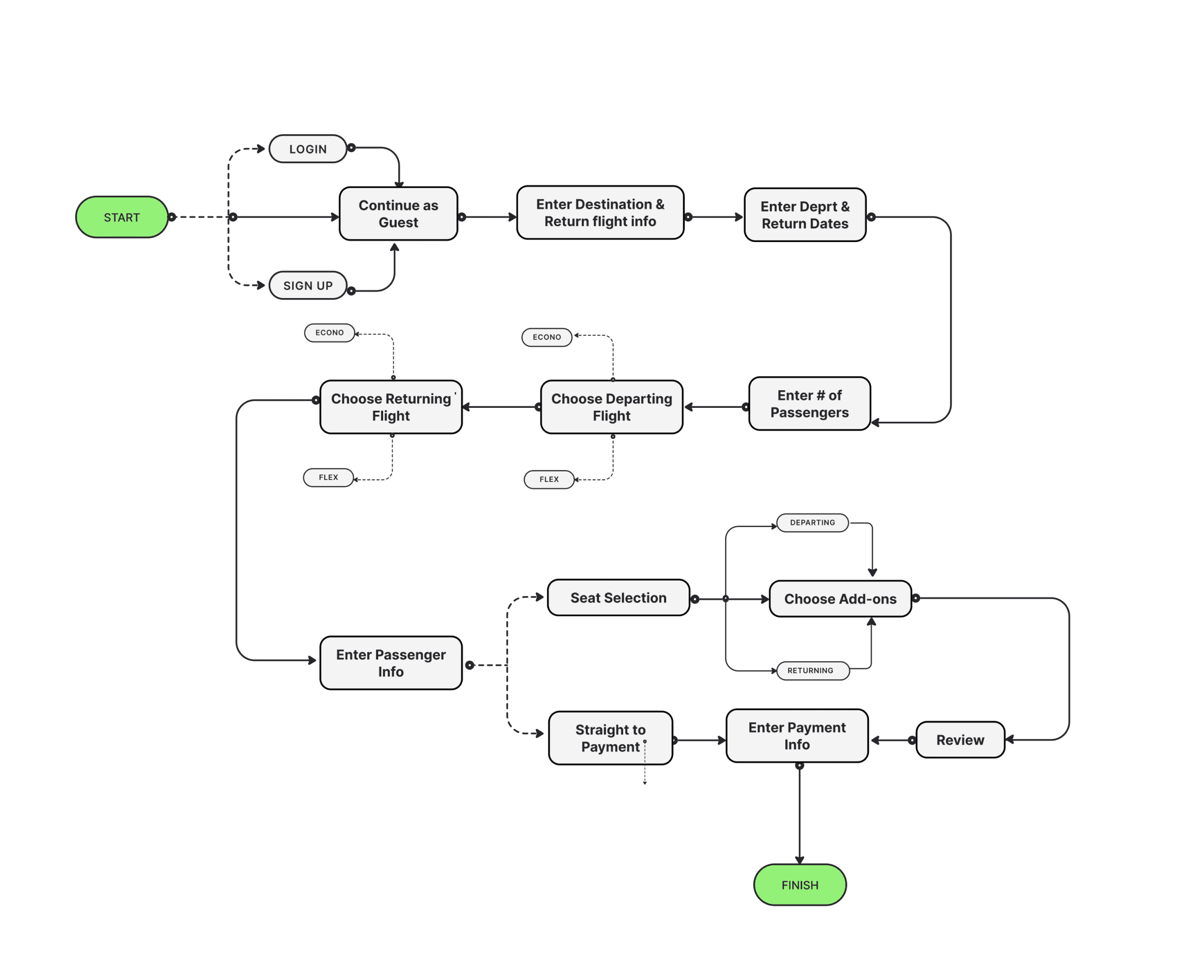
The flow included the following steps: Home page > Select flight dates > Choose destination > Confirm passenger information > Select seat > Get-A-Glimpse > Confirm seat selection.
Design
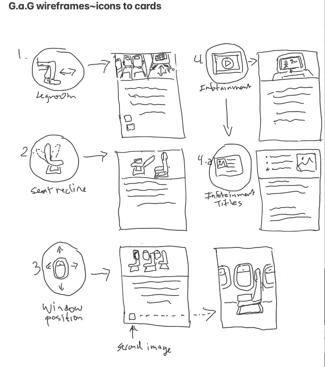
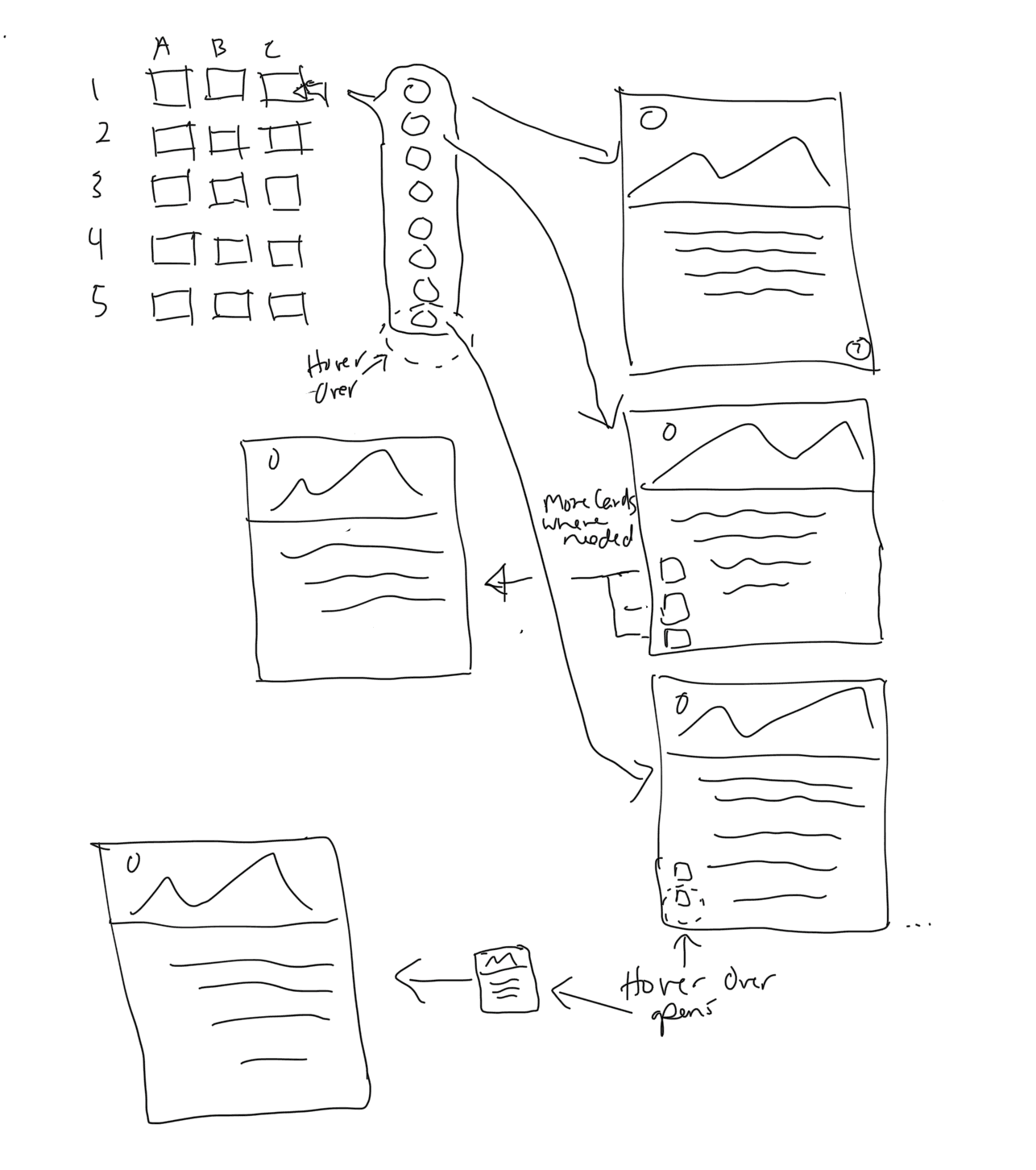
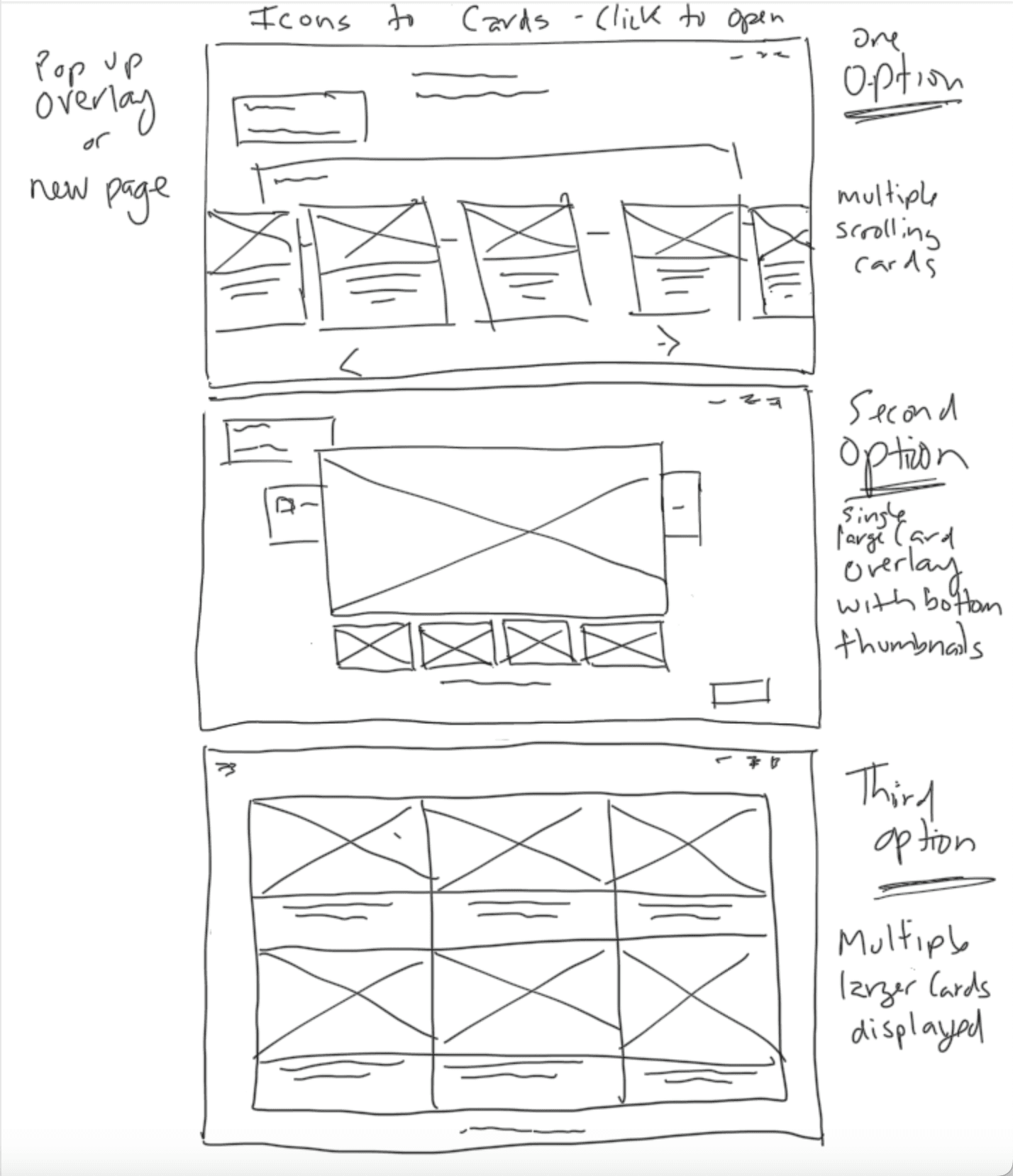
Sketches/LoFi Wireframes
With the user flow/journey complete i was able to better visualize the needs for this new feature. I started by sketching ides on to paper fleshing out the look of the icons represent the different features.
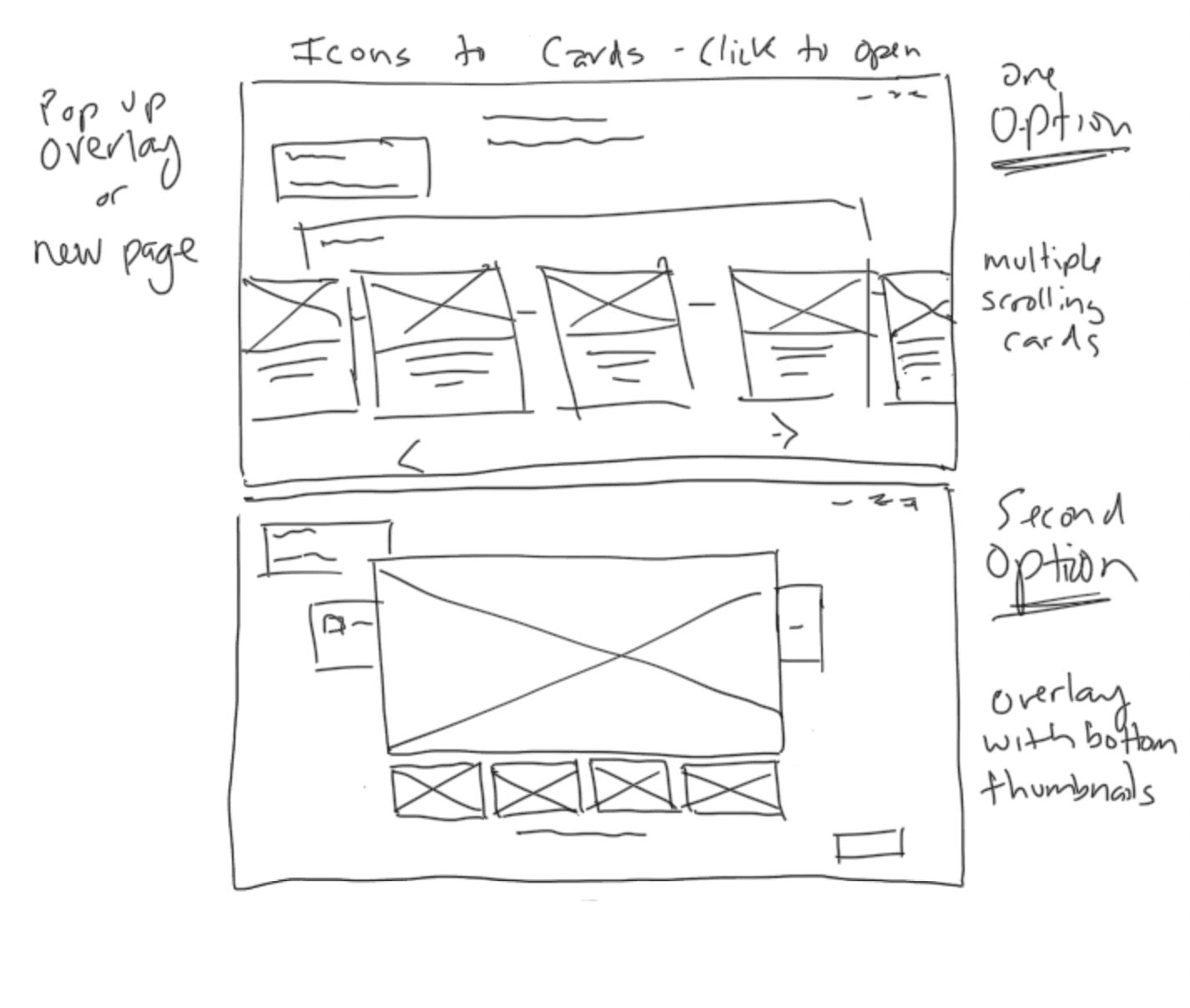
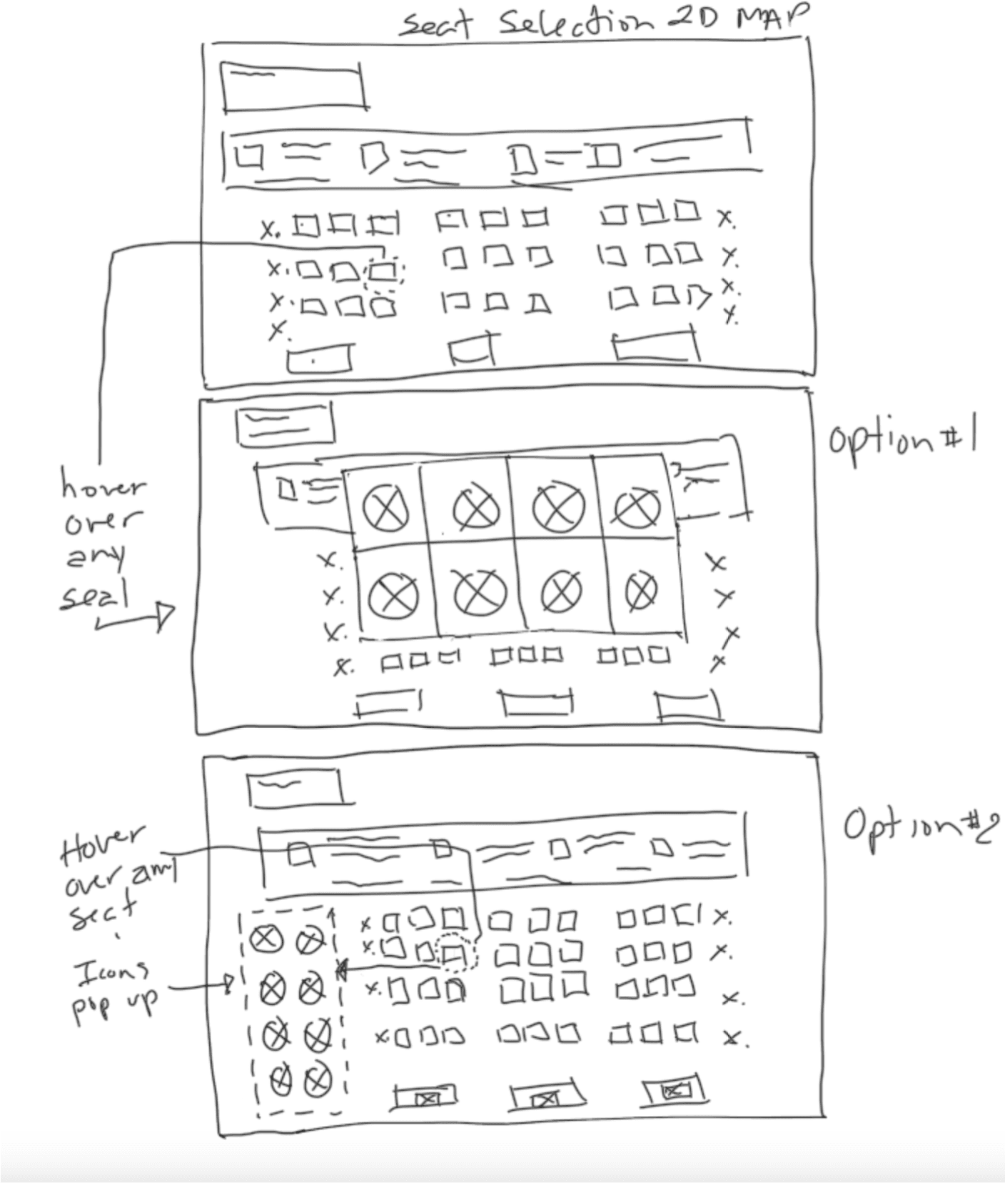
The hi-res wireframes came together quite well which led to the development of the feature feeling more and more likea an already existing product.
Added some desktop size mockups here as well.
Hi-Res Wireframes
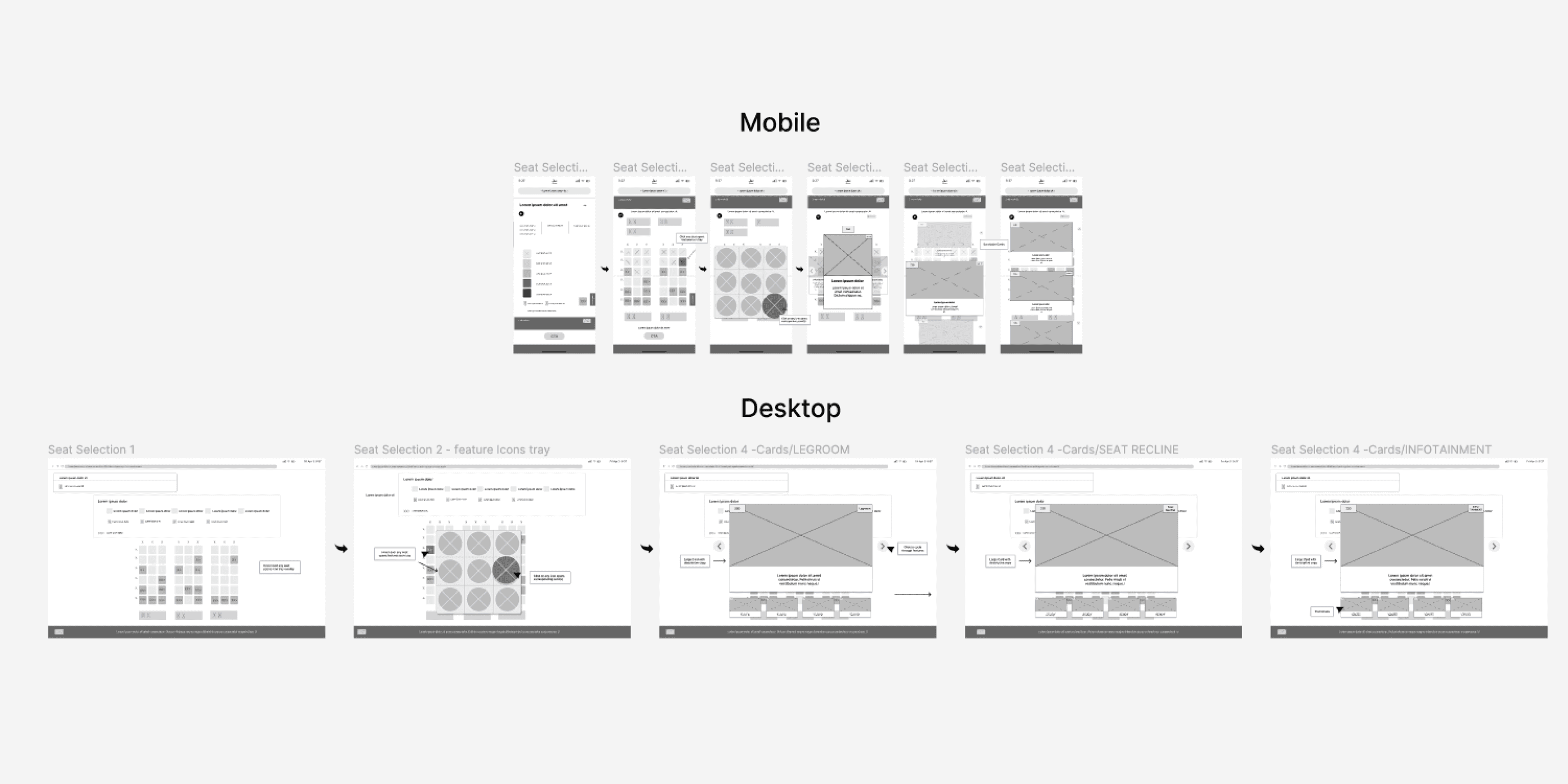
Icon Development
Icon development was crucial as it needed to seamlessly integrate into Singapore Airlines' existing site design. I aimed for an intuitive and user-friendly interface for this new feature to enhance overall usability and user experience.

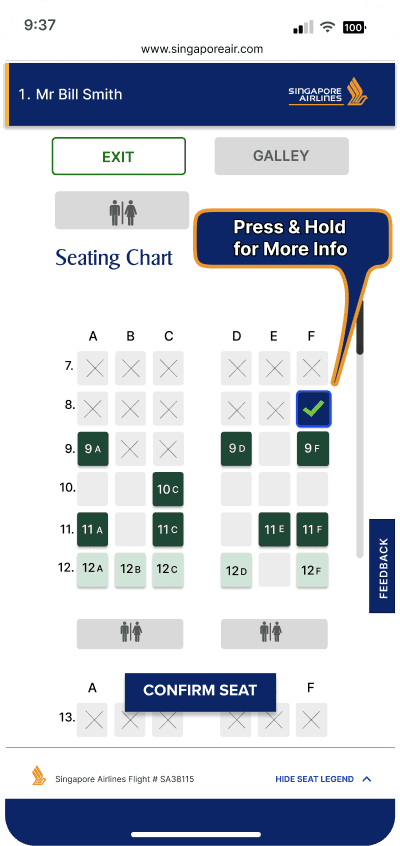
Hi -Res Mockups


Prototyping
After finalizing the general look and feel, creating my flows, and designing key screens, it was time to develop the prototype.

View Prototype
This prototype guides you from the home page through searching flight details to the Get-A-Glimpse interface and finally to seat confirmation.
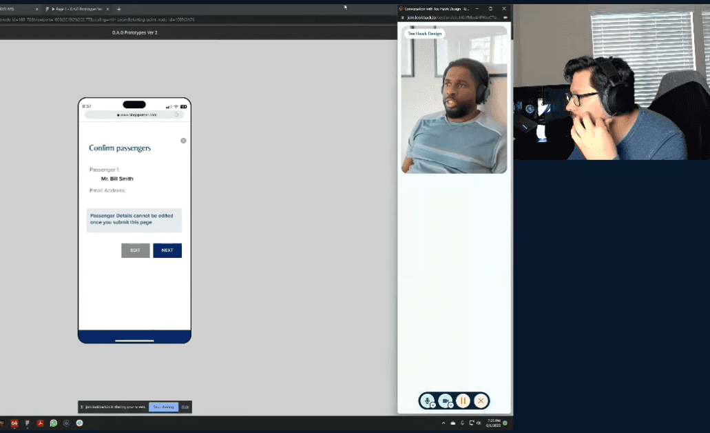
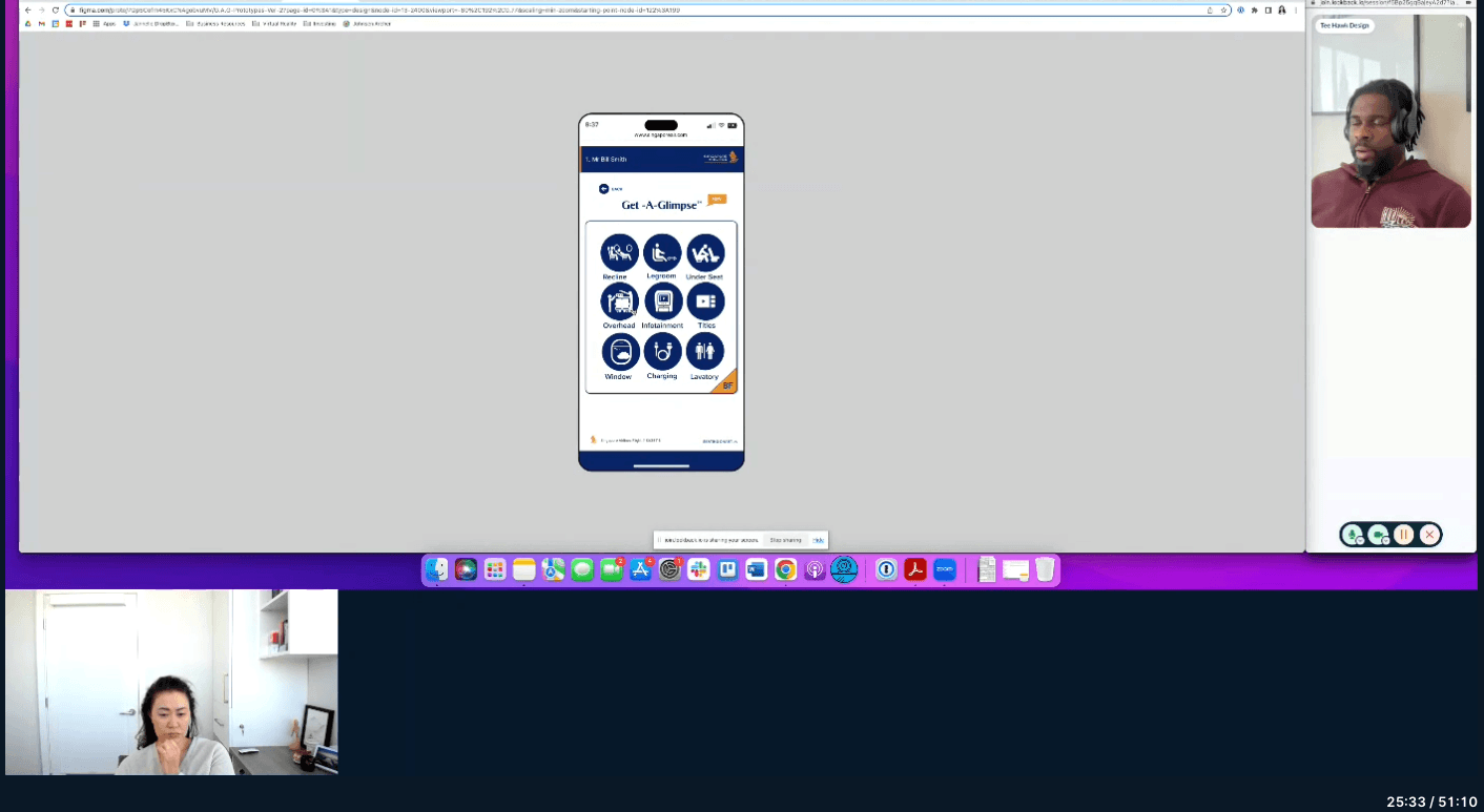
User Testing
The goal for the moderated usability test for the mobile functionality was to learn how easy it is for users to access the features, understand which each feature and the accompanying icon was and see if users could successfully complete the task of selecting a seat aided by the new features. I also learned what users enjoyed or were happy with from the new available features and also what they did not like or would wish to change. I conducted the test using Lookbak io as well as Zoom.
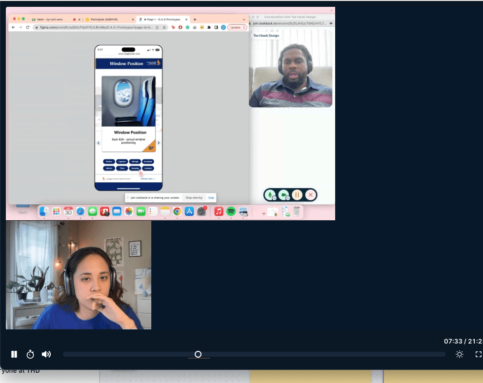
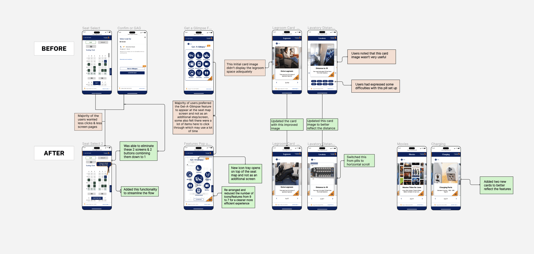
Design Changes
Iterations were needed to improve the overall design and with the help of the usability test results I was able to get valuable feedback needed to make the necessary changes to the designs. Key changes to the Get-A-Glimpse icon tray, removal of the pills and the ability to see all the features from the seat map screen to name a few were implemented. Some minor revisions were also made as well.
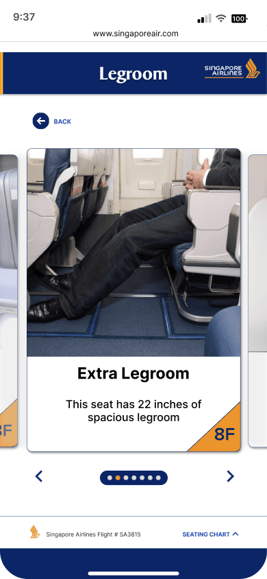
The Solution
Introducing 'Get-A-Glimpse', an exclusive Singapore Airlines feature providing essential information during seat selection to enhance the user experience.


Reflections
What I learned
Future Goals